NEW Scanlens release 2019

The centering on the Maxwell is very off centre......its cut crooked?

But still better than some of the others, like my Dipper.

EB373ACD-11DB-4F76-B64E-4D26C74DDB30.jpeg
 
I was looking before at these on my phone and they looked ok, but now I'm looking on a computer screen and i see what you mean @Matt26. The Maxwell is very odd and Johnson not a lot better. But the Didak is ok. Why cant they get this right.
 
Not that I care as I won’t buy one but it’s a shame to see a player rush a signing, pathetic effort from Maxwell. At least the centering appears to be better this time round.

Yep, that is shocking. Should be demanding he does it again.

Why pay the players dollars if they show no care/respect.
 
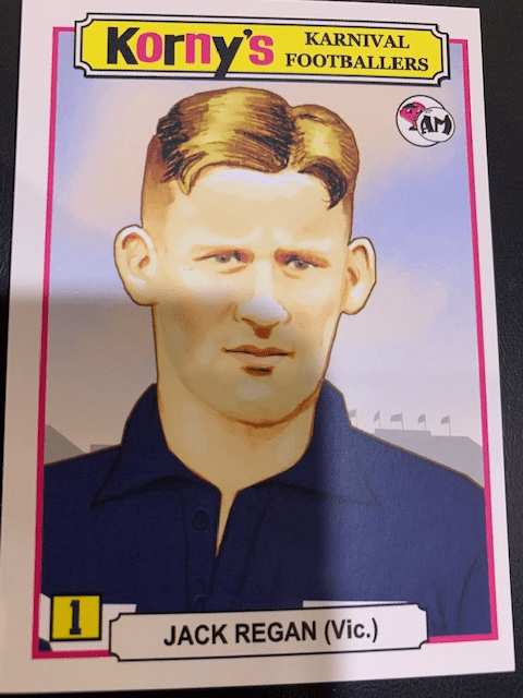
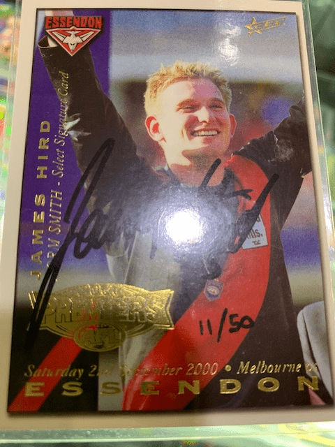
Yep, there's some centering issues, actually had a long chat with the printers today and it's not a simple process. Sounds easy but due to the thickness of the cards they need to be stuck together, and the foiling process is done separately as well. We are working hard to rectify this. I thought I would show some examples of previously lauded cards just so you can see that others struggle too, and they are producing thin cards.
1564657242806.png
1564657211454.png
 
as for the Maxwell signature, not the greatest but that's how he has always signed so it's a tough one. We're hearing the comments and trying our best, and there's some good product still to come. Apart from the centering issue do you prefer the club colour background? We went old school on the early ones and were trying to replicate the 1968 Scanlens but not sure those colours worked.
 
It is better than that but not the best look if your searching for the worst case scenario to compare.

I like the simplicistic concept but think there is a fine line between simple and boring.

The appeal to the plain old cards is their age and rareness. When 're produced I feel they lose that appeal and as such need to have some sort of uniqueness to them.

Or as others have said if your going plain then you have to make sure everything is neat and spot on (signature, spacing etc)
 
Yep, there's some centering issues, actually had a long chat with the printers today and it's not a simple process. Sounds easy but due to the thickness of the cards they need to be stuck together, and the foiling process is done separately as well. We are working hard to rectify this. I thought I would show some examples of previously lauded cards just so you can see that others struggle too, and they are producing thin cards.
1564657242806.png
1564657211454.png

The difference, of couse, is that the Jack Regan card is a common that can be had for $3.00 or less, and not a limited edition costing $25 ...or more.
 
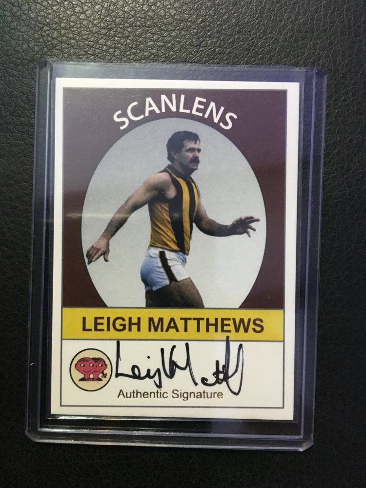
So just bought my first Scanlens sig card, mainly cause its Leigh Matthews, and must admit am disappointed the quality is poor. It’s been cut crooked (see the top edge) and is actually cut over size so doesn’t fit into a one touch.........wont be buying anymore.
D0587698-CC7E-497A-9D48-DA58EF07DA9D.jpeg
 
So just bought my first Scanlens sig card, mainly cause its Leigh Matthews, and must admit am disappointed the quality is poor. It’s been cut crooked (see the top edge) and is actually cut over size so doesn’t fit into a one touch.........wont be buying anymore.

D0587698-CC7E-497A-9D48-DA58EF07DA9D.jpeg

Yeah they are junk.

I got the Kerr, Cousins and Glendinning and all of them have glaring issues. I begrudgingly bought them but if they can't be arsed putting a little time and care into it to fixing the issues that they have had since launch then it just comes across as a cash grab and one i will be happy to skip from here.

Compare them to another bootleg release, the Harv time signatures and there really is no comparison for quality.
 
So just bought my first Scanlens sig card, mainly cause its Leigh Matthews, and must admit am disappointed the quality is poor. It’s been cut crooked (see the top edge) and is actually cut over size so doesn’t fit into a one touch.........wont be buying anymore.

D0587698-CC7E-497A-9D48-DA58EF07DA9D.jpeg

That’s a real shame mate because it colours, image and design work pretty well on that one. They have had a fair amount of time to sort this issue out so I seriously can’t believe it’s still happening. Where did you get this from by the way? Haven’t seen this Lethal advertised at all.
 
Out of interest, how has this set been doing (Sales wise)?

I personally did nit chase any so have not kept up to date with the general consensus on this release.

I am keen to know if many have added them to their collection.
 
Although the execution could be better, not helped by the images feeling cheapened due to AFL licensing restrictions, I don't mind the concept. I've considered purchasing cards on more than a few occasions, but haven't yet done so. As a club collector I feel with a set like this buying all cards would be ideal, however with more and more Collingwood cards being rapidly added to the set (6 players & 1 coach) it's difficult to go all in with the current outlay standing at $785 and the end point being unknown.

On top of the seemingly more compact HarvTime series that I'd previously started buying and Select Supremacy there's a lot of nice options around currently and I simply have to be fussy with what I purchase. It's a bit of a shame that these 3 sets have dropped at much the same time.
 
Back
Top Bottom