Flawless 2013/14 Thread

Really when you look at them there's no creativity to the design at all just a plain white background
Pretty 1st grade in my opinion

Here's what they should Atleast resemble lol
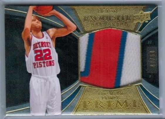
image.jpg

You're right, but this is what people have to settle for now. It's pretty bad, I've complained about the white background since the 2nd year of NT.

You could put a huge patch with an auto and no background at all and it would still sell, bloody stupid if you ask me.

That Exquisite is nice:)
 
For my PC I was really hoping for a large patch ("patch", NOT trim). I like last year's large patch cards (overall better even), and was intrigued by the horizontal design with an action shot. Not too enthused with the dual patch design, plus the ones I've seen the patches are put in there at weird angles. I think a better design concept if you're doing a large dual would have been either front and back of the jersey, or home and away, not random pairings as they appear to be.
 
You're right, but this is what people have to settle for now. It's pretty bad, I've complained about the white background since the 2nd year of NT.

You could put a huge patch with an auto and no background at all and it would still sell, bloody stupid if you ask me.

That Exquisite is nice:)

People still buy, no matter what. If you take a step back from the hobby and see what people are paying for a piece of cardboard with a bit of players shoe in it, it's pretty funny. But if you're collecting singles, you have to thank the people doing it or we wouldn't be getting the singles lots of people crave!
 
For my PC I was really hoping for a large patch ("patch", NOT trim). I like last year's large patch cards (overall better even), and was intrigued by the horizontal design with an action shot. Not too enthused with the dual patch design, plus the ones I've seen the patches are put in there at weird angles. I think a better design concept if you're doing a large dual would have been either front and back of the jersey, or home and away, not random pairings as they appear to be.

There's plenty of trim in last years though also.

The Dual Patch has been terrible this year IMO, but I'm sure last years design or something thereabouts will be back next year.

Oh well, hopefully Prizm will be nice but by the looks of the NFL previews there's still 20 parallels and new colours heading that way.
 
Whichever way you choose, it's not by much. Both are nice.

You either go for the vertical design where your player is missing half of his hair, but you get the team logo in foil

or

the horizontal design with a bit more white but a picture of the player in action.

Your example is disadvantaging the newer release as it has a weak patch.

It really depends on the purpose.

But..... If I owned most of the set I know which one I'd be saying I preferred.

The set is too huge for me to own half of it... But also I think they're damn nice so wanted plenty of them. The new ones, of which I was initially keen to get a few, are not as good as I thought they'd be. The player pic looks too small/skinny to me, and like there's something missing. Also, the patch shouldn't be that crap in a $1750 product!!!
 
Back
Top Bottom